The Electricity Markets & Policy Group at Berkeley Lab, part of the US Department of Energy, has released their annual update of utility scale solar power plant pricing, sizing, hardware trends, locations, etc in the United States. The information is released is multiple formats. A clean powerpoint with key conclusions, a spreadsheet with lots of great project-level information (including solar+storage PPA pricing), and a collection of interactive visualization tools.
These tools allow analysis of the projects via:
- Power Purchase Agreement Price, since 2006
- Capacity Factor
- Capacity by State
- Technology / Inverter Load Ratio
Of the data communicated, the chart most anticipated from the report is of Power Purchase Agreement (PPA) pricing:
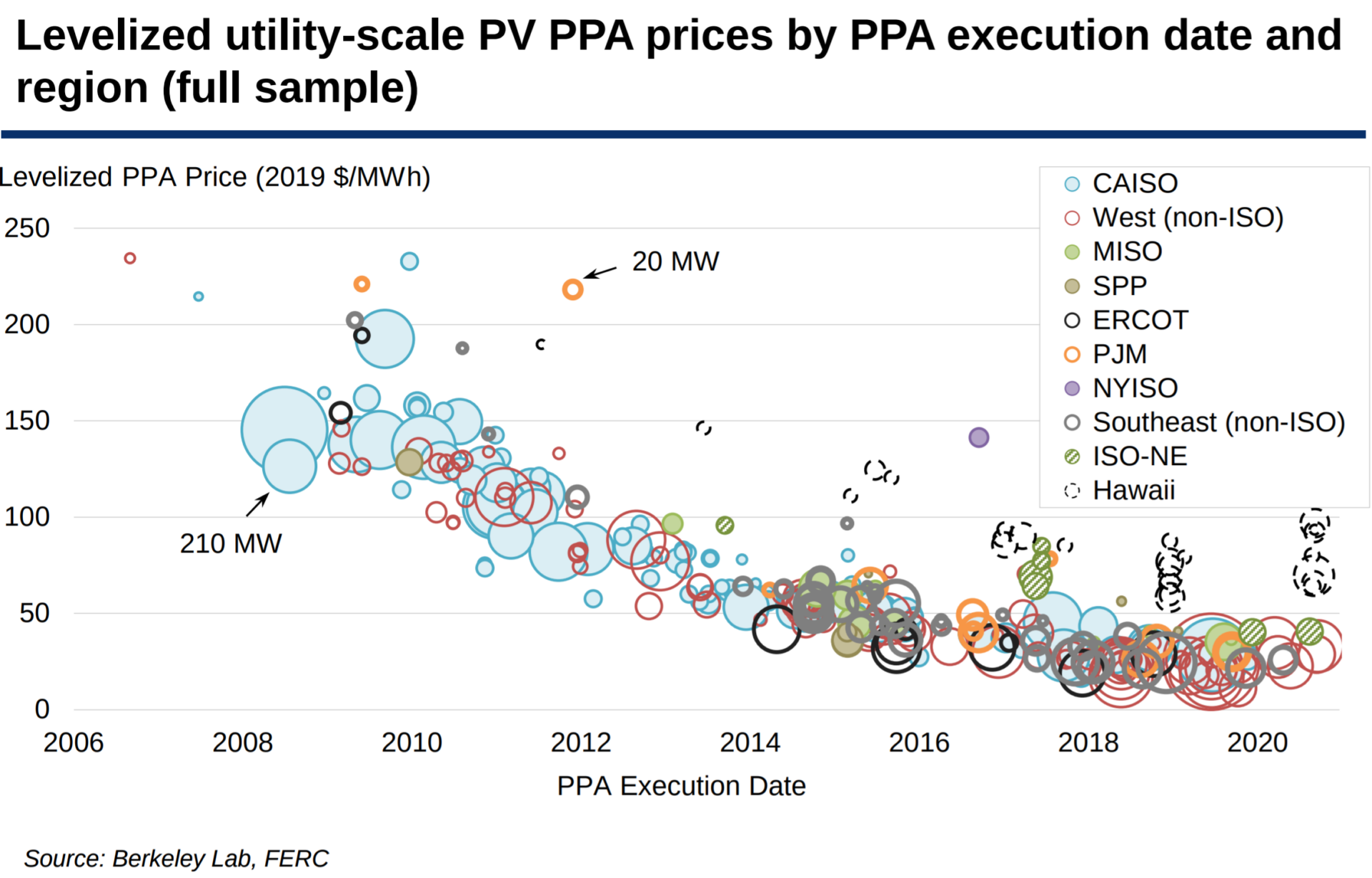
The most obvious pattern is that pricing is way down from 2006. The data includes 338 contracts totaling 23.1 GWAC of projects built from 2007. Nationwide, the average levelized PPA price fell to 2.4¢/kWh in 2019, down 17% from 2018 and more than 80% since 2010.
From that lonely first PPA signed on September 1, 2006 at a price of 23.446¢/kWh, with the most recent signing at a rather pedestrian 3.3¢/kWh signed just two months ago at the end of September. The lowest price in the document is a 1.139¢/kWh signed on October 17 last year.
Of note in recent years are solar+storage facilities being included – specifically those in Hawaii with the black dashed circles.
Also consider looking deeper at the reports spreadsheet, where the authors compare solar value vs PPA price, and vs solar penetration.
The inverter loading ratio by mounting type, and installation year, shows some nuance that only designers within the largest solar power companies can see just yet.
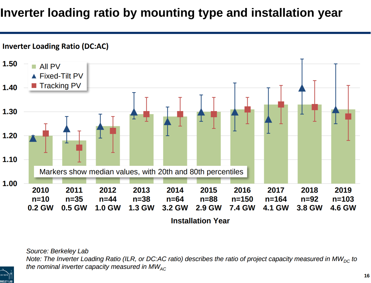
First, note that load ratios – the total wattage of solar panels (DC) to inverter wattage (AC) – have generally increased for all project types, though seems to have topped out over the last three years. Then see that this past year it actually decreased – pulled hard by tracking PV systems. This author supposes that this is driven by trackers’ high generation coupled with bifacial solar panels – and that these projects are now hitting the fields.
As CommercialSolarGuy has yet to deploy a bifacial project (we have two carports currently in development with bifacial product), we have no direct experience dealing with the generation curves of these projects. However, we have encountered multiple data points in our readings referencing lowering DC to AC ratios due to the bifacial bonus output.
Soon though, we may see this tracker/bifacial downward push disappear as we integrate more and more DC coupled energy storage (for instance – the Eland Solar project in Los Angeles is a 1.75 DC:AC ratio).
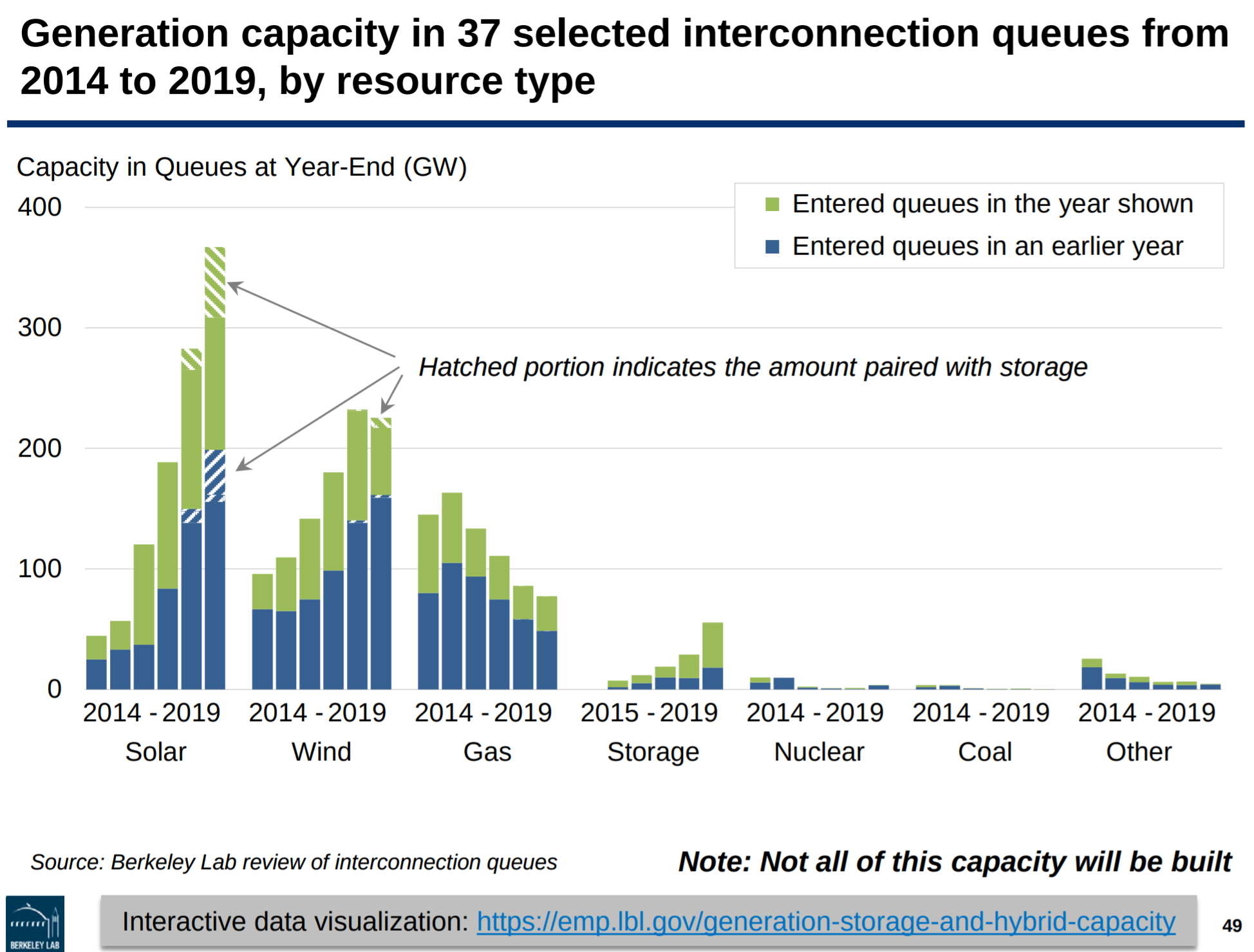
The report also collects data from from interconnection queues for 7 ISOs and 30 utilities, representing ~80% of all U.S. electricity load.
In total, there’s 370 GWac/~481 GWdc of solar power in the interconnection queues. Of that, 102 GWac of that is co-located with storage, including a few hybrid facilities that include wind and/or natural gas plus storage.
For comparison’s sake, Biden’s plans might suggest we need 800 GWdc installed by 2035. In 2019, the report finds that we added 168.4 GWac of capacity. This suggests to this author that developers can find the capacity needed.
Solar+Storage pricing is broken down on a project basis within the spreadsheet (linking to it again).
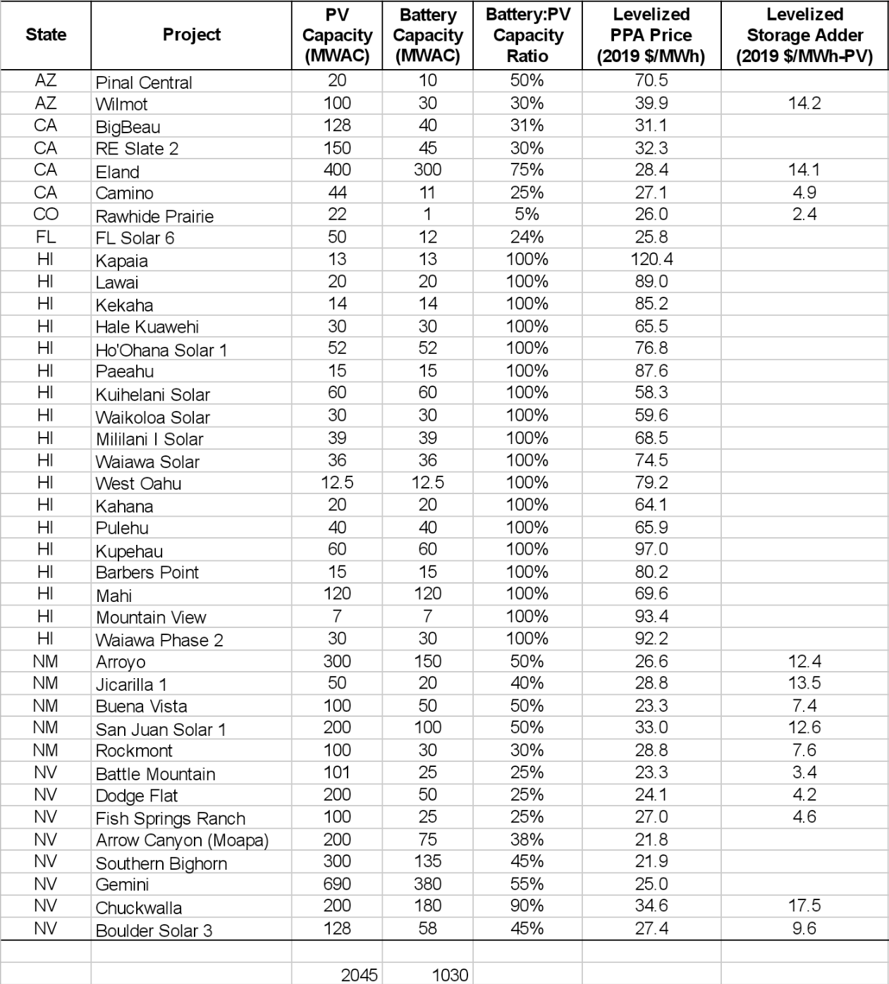
The above image is a screenshot from the spreadsheet of the 38 unique solar+storage project PPAs. The projects total just over 2 GWac of solar power, plus 1 GW of energy storage capacity.
ThePPA pricing ranges from just over 2.1¢/kWh through 12¢/kWh for a project in Hawaii. The chart does not note the DC sizing of the solar, nor the hourly ratings of the energy storage. These two data points will vary widely across project use cases.
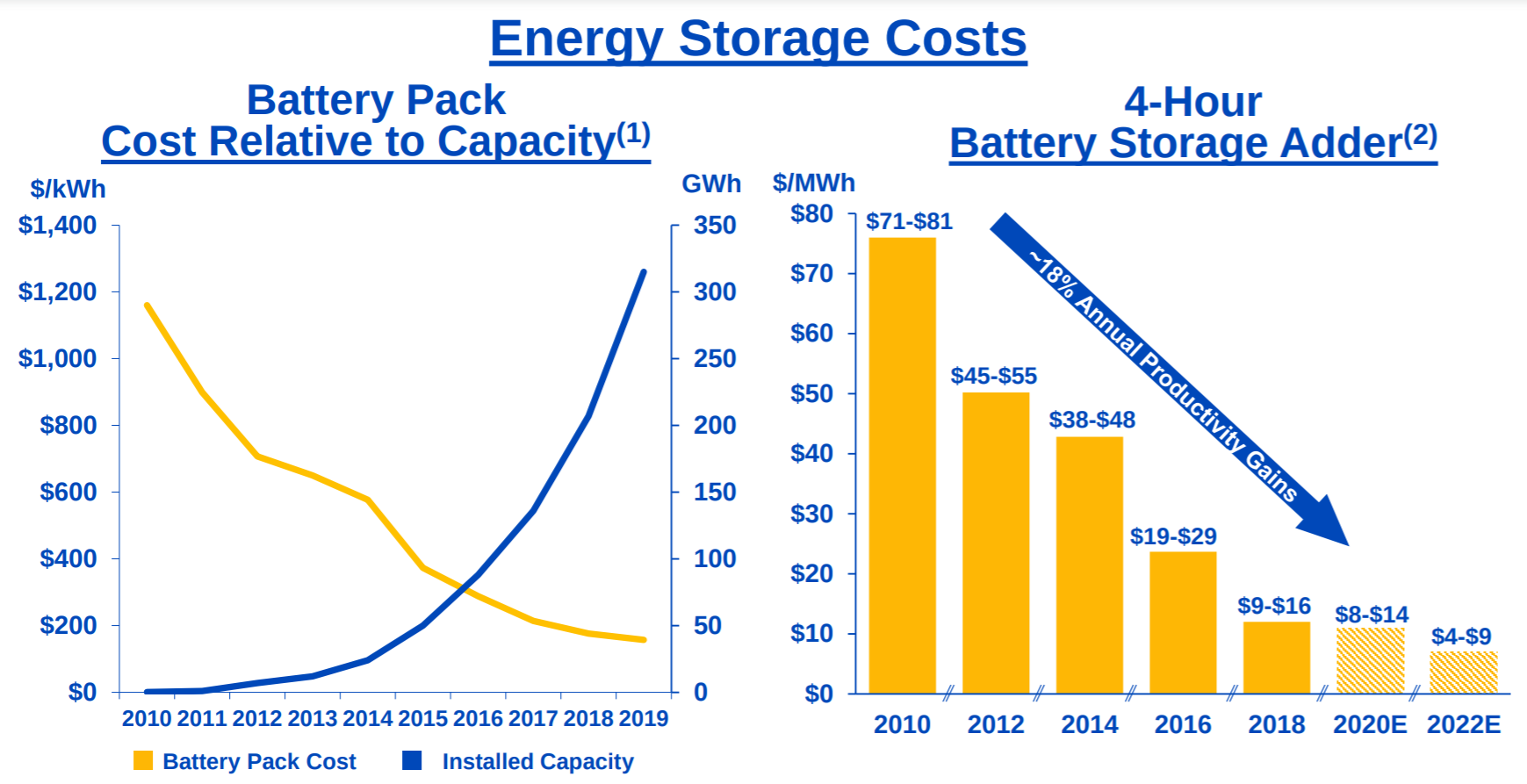
The solar inverter to energy storage inverter ratio also varies greatly. In Hawaii, you’ll notice the two inverters match in size, while other common ratios are 2 and 4:1 solar to energy storage ratios. In NextEra’s annual investor presentation, the company notes a ratio of 25% solar to energy storage inverter, with a 4 hour battery attached to reach the below pricing going forward.
One last chunk of data to check out – the Capacity & Generation by State page. On this page they share the percentage of in-state electricity sales or generation from small, larger and all solar pv systems. On this chart, when looking at the generation numbers – we see that for all electricity generated within the various states – solar power has broken 10% in Washington DC, California, Vermont, Massachusetts, Nevada and Hawaii. The difference between generation and sales gives an indication of distributed (<1MWac) versus utility scale (>1MWac).
Broadly speaking, this release has a lot of amazing information that can be used to broaden one’s knowledge on utility scale solar pricing. Note that here, nearly all of that knowledge has been communicated in the few hundred words of this article. Please delve deeper.
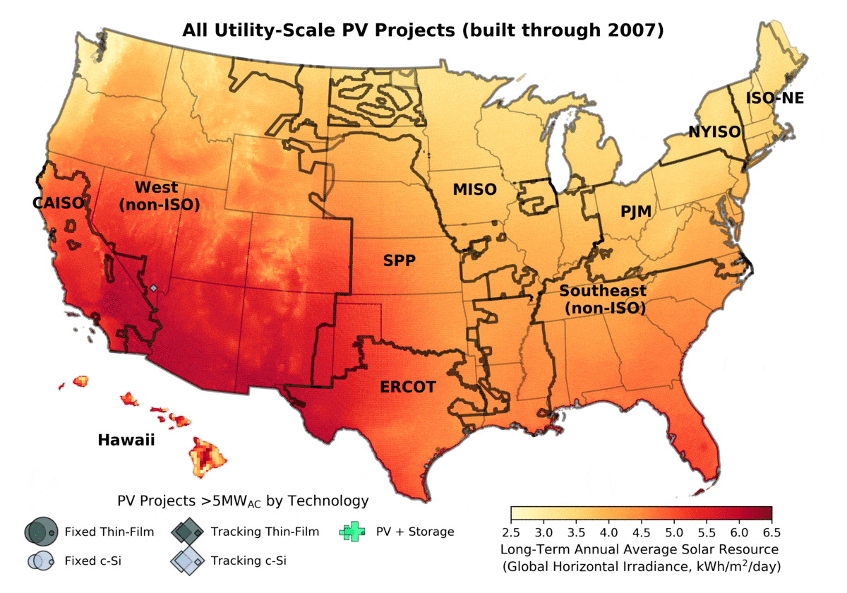
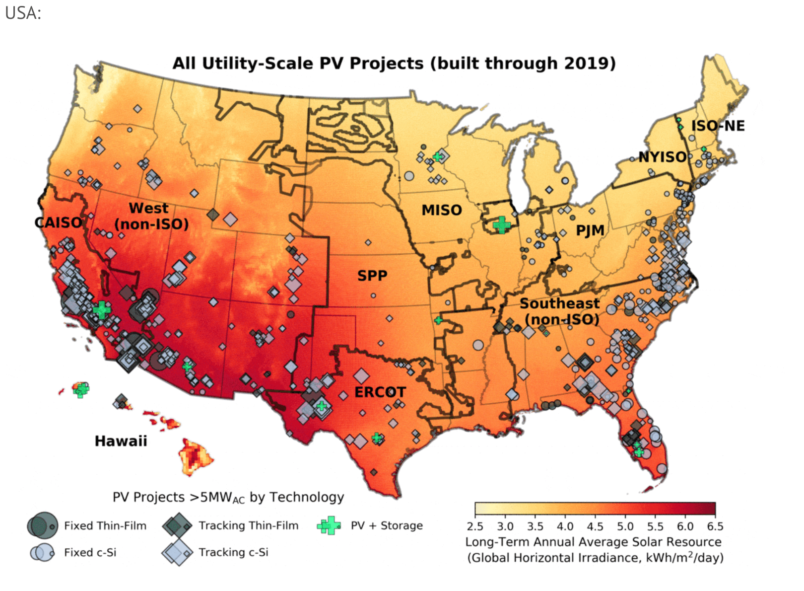
And just for entertainment’s sake – here’s a gif of utility scale projects being built by year across the USA: